UX Redesign of Alterian's CX Platform

Background
Alterian's CX platform, 'Real-Time CX', (a B2B SaaS product) is a Forrester Wave Leader and their clients include HP, Scottish Power and Mastercard. The platform focuses on optimising customer journeys by leveraging AI, journey analytics, and real-time orchestration to enhance customer interactions across various touchpoints. It helps businesses deliver personalized experiences in real-time, reduce customer churn, increase satisfaction, and improve overall business outcomes.
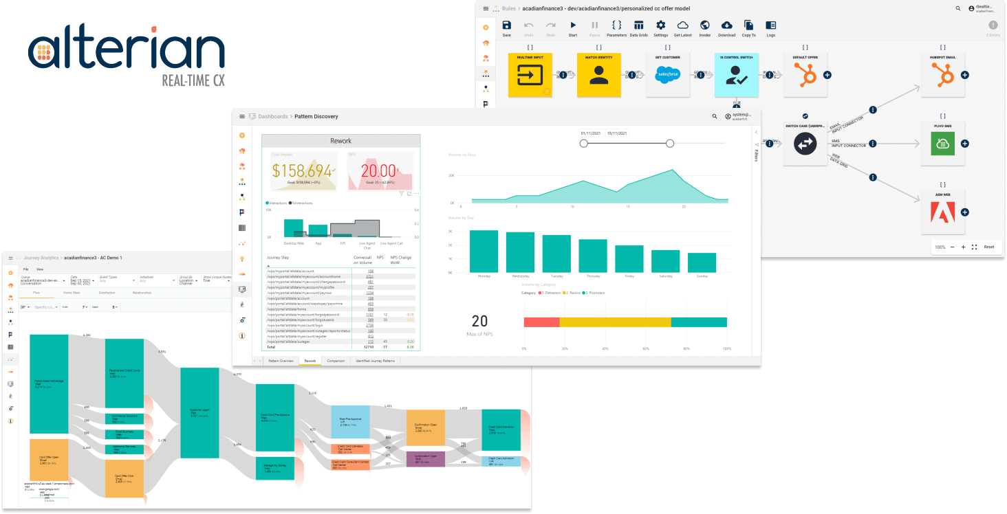
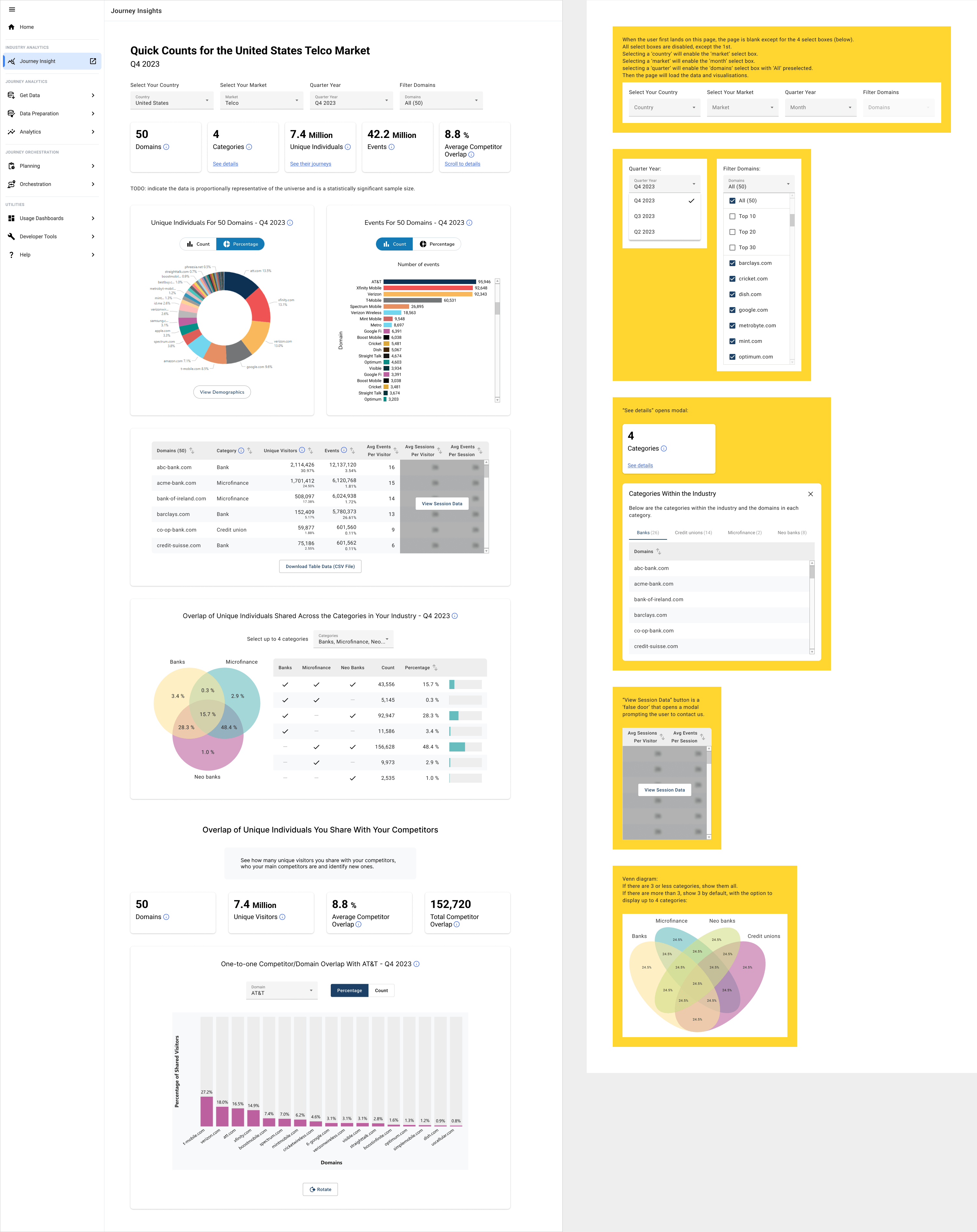
'Real-Time CX' is a powerful feature-rich platform that had grown organically, and the user journeys had become convoluted, over time. This meant that it had a very steep learning curve. I was tasked redesigning the platform from the ground up using an evidenced-based approach that leverages user research and testing. I needed to make the platform easier for users to get started quickly and more intuitive to use, as well as updating the overall look and feel.
User Research Interviews
It all starts with User Research. The purpose of user research is to identify pain points, goals, and workflows. This was done by talking to users, conducting surveys, watching session recordings, analysing GA, and evaluating competitor products.
Interviews were conducted with customers and also with people within the business that come into contact with real users (e.g. sales, account managers, support, professional services, etc).
Some insights that stood out were:
- Users want a way to link their qualitative data to the quantitative data. Connecting the 'why' to the 'what'. At the moment we show them what's happening and they want a way of connecting that to 'why' it's happening.
- Users primarily use it to find and fix 'broken' journeys, i.e. identifying issues, prioritising them, and then fixing them.
- Journey Orchestration features are used much less because of a steeper learning curve.
Personae
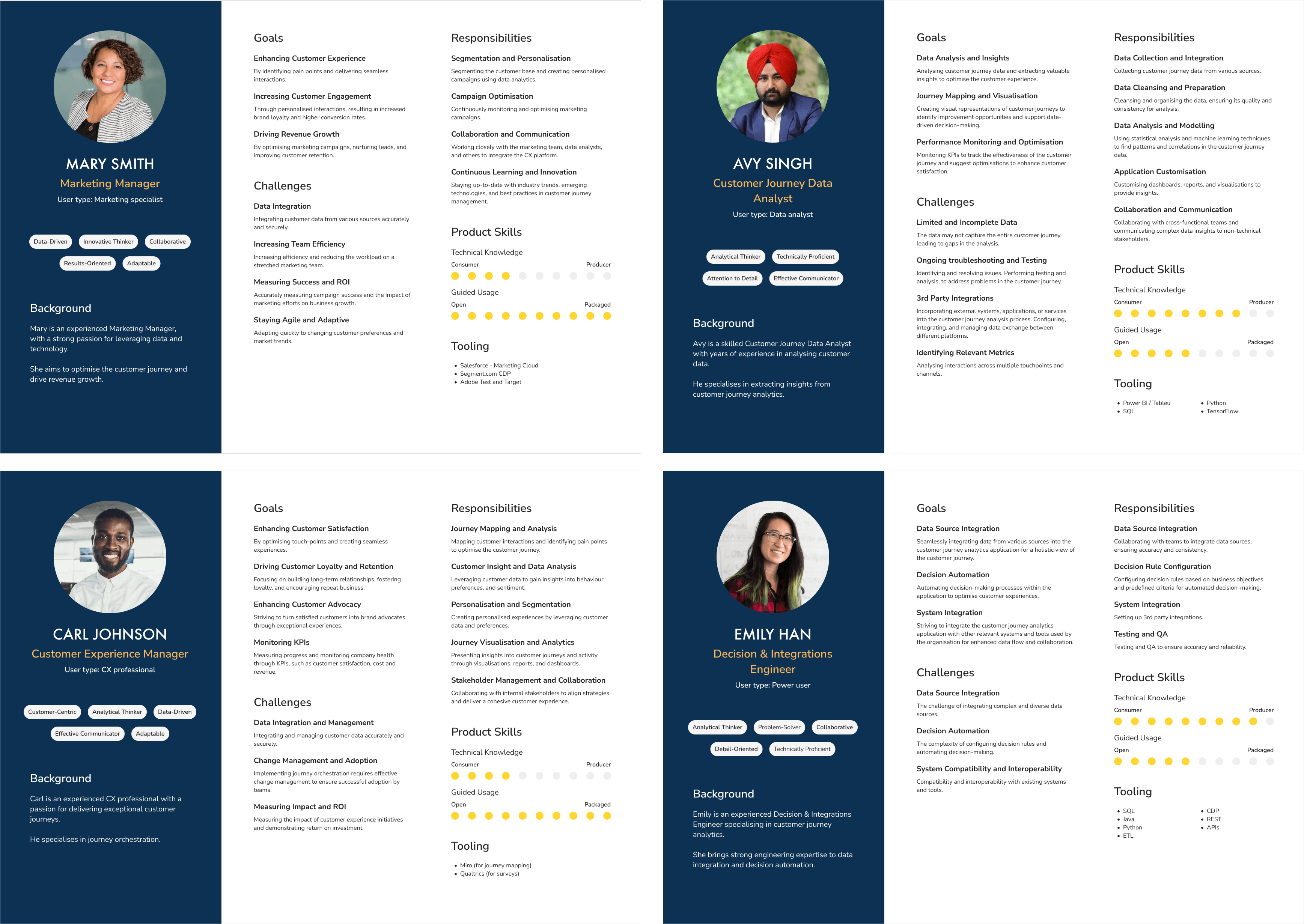
Personas represent the different types of users that interact with our product. When defining User Personas, we're trying to figure out who our users are and we try to empathise with their motivations, their needs, their goals and their challenges.
We did this by conducting user research interviews, surveys, and interpreting analytics data and we created this matrix:
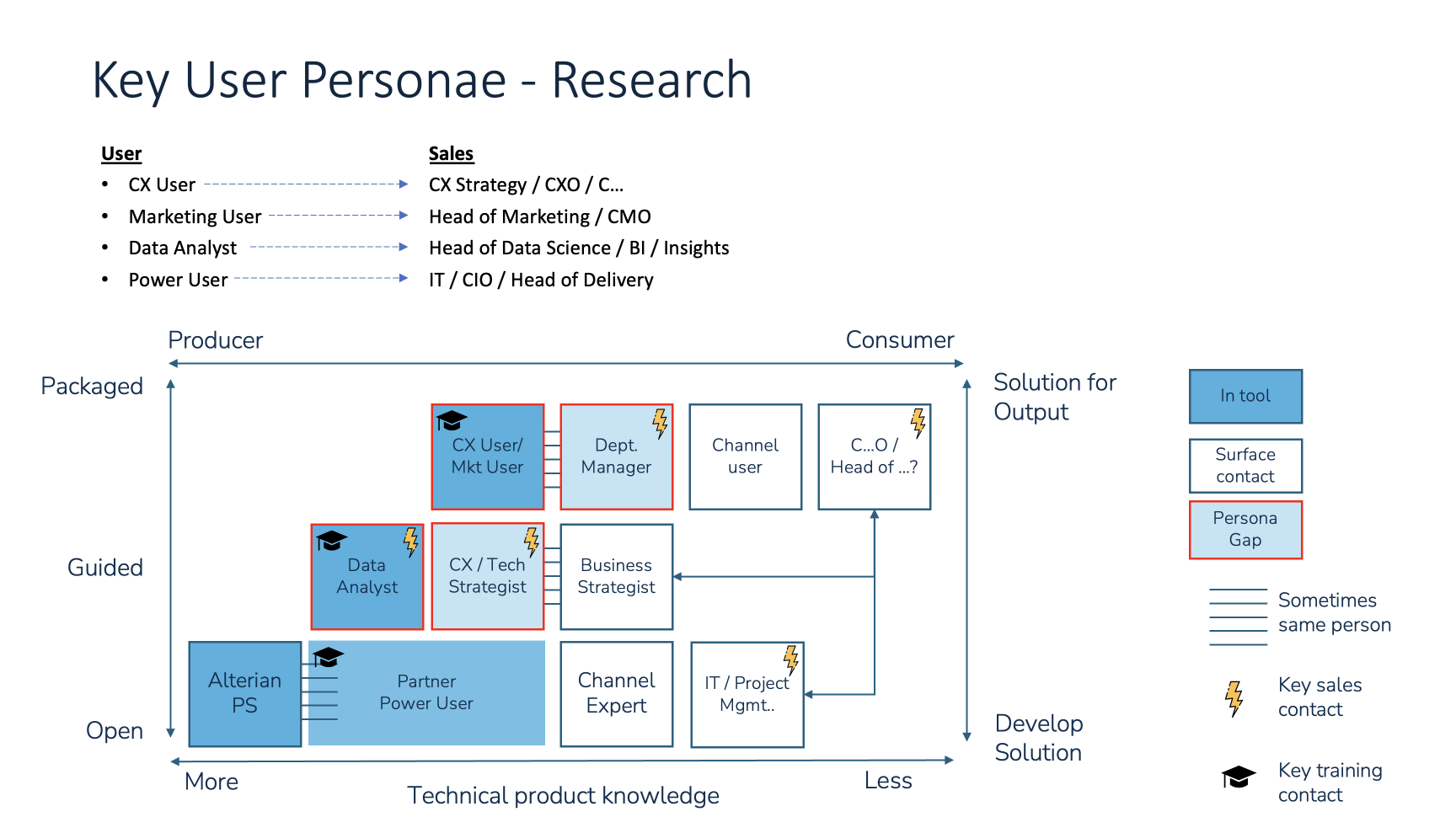
I create profiles for 4 user archetypes, describing demographics, motivations, behaviours, pain points and goals.
After conducting more user interviews, both internally and with customers, these personas were refined further.
I found that, in reality, the 'CX professional' role is split across both the technical user and the business user, which is reflected in the personas. The personas will continue to become more refined over time.
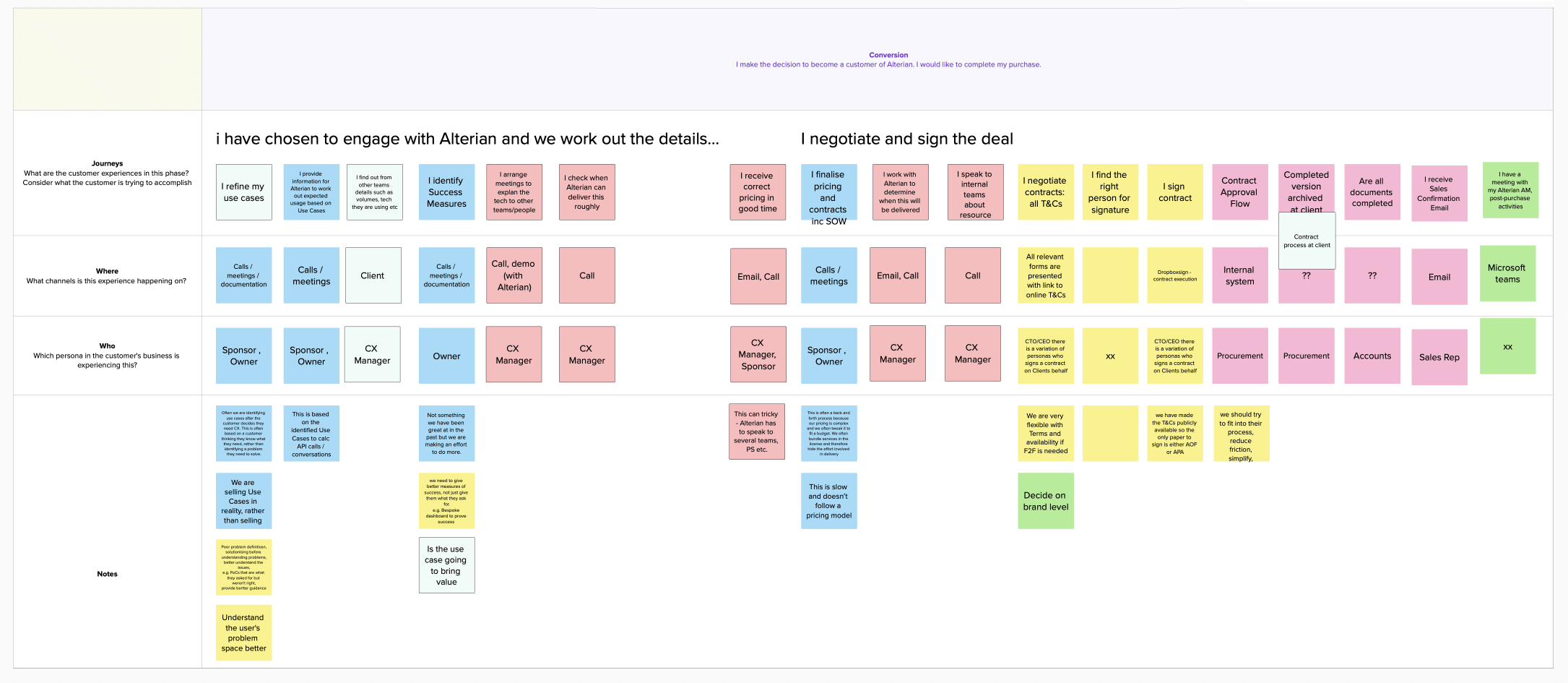
Customer Journey Mapping Workshop
These are the phases in the journey map, in context of an Alterian customer:
I held a number of workshops with people from across the business. The purpose of these workshops was to:
- Define user journeys - We have to identify the typical user journeys and determine the steps users take in those journeys, from initial onboarding to completing tasks or accessing specific features.
- Identify pain points, areas of friction - We have to identify pain points, areas of friction, and opportunities for improving the UX.
- Focus on streamlining workflows - We have to focus on streamlining workflows and reducing friction. By guiding users through these workflows, providing clear instructions, progress indicators, wizards, etc.
Awareness
Consideration
Conversion
Onboarding
Engagement
Loyalty
User Flow Diagram
After figuring out who our users are and their goals, we need define the tasks they'd need to perform to achieve those goals.
To do this, I held a workshop to explore the stages our users go through, and we defined, at a high level, the activities users perform when using the product.
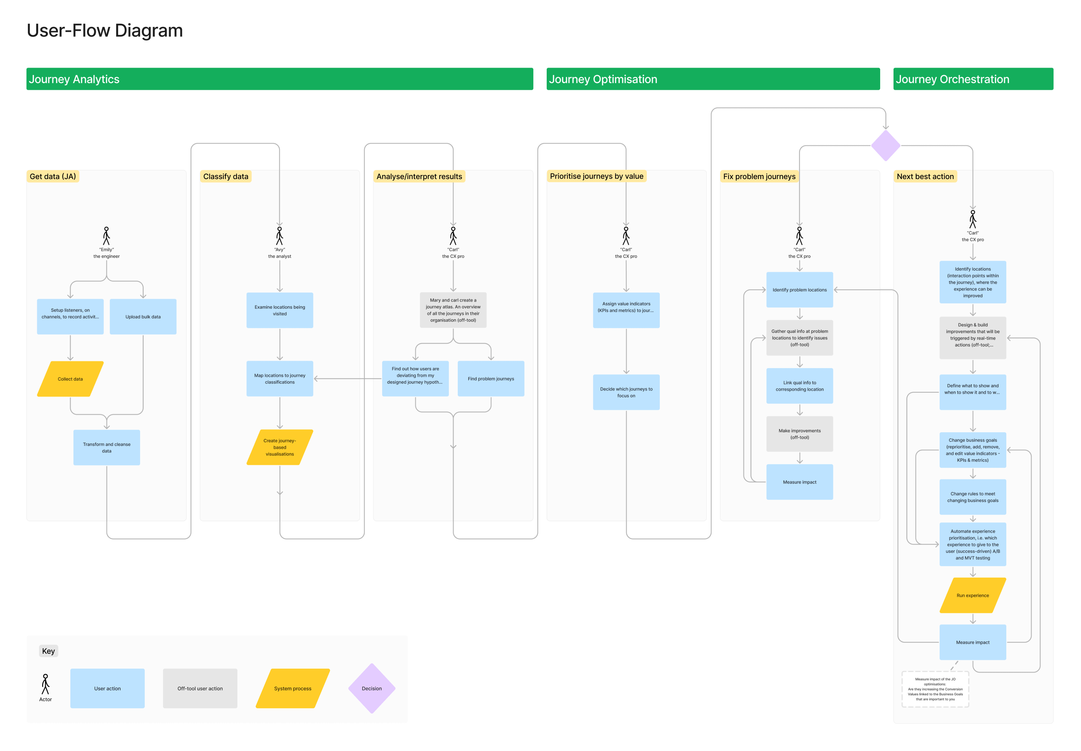
I created the user flow diagram in the context of the personas defined earlier. The user flow diagram aims to capture, at a very high-level, the sequence of tasks all the personas perform on and off the platform.
The vertical swim-lanes are all the different areas of activity we've identified for each persona and we could see that the app is divided into areas of related functionality, split across journey analytics and journey orchestration.
This user flow was validated with internal reps from different functions in the business and through user interviews, I also captured the challenges at each step. This will help underscore our product direction and objectives
This is an evolving artefact, not 'one-and-done'. It will feed directly into the information architecture and the user story map, as well as framing future activities.
User Flow Steps - Details, Pain-points and Challenges
Step 1: Get data
Emily the engineer sets up listeners, on channels and touchpoints, to gather data. Then the system starts collecting data. Alternatively, she can upload bulk data.
After data has been collected, she then needs to transform and cleanse the data. That means tidy up urls by using 'find and replace' type functions, so that there are fewer unique locations which are displayed as nodes on the Sankeys.
Step 2: Classify data
Now we move on to the 2nd step: We've got our data, and now we want to organise it.
Avy looks at the locations users are visiting and paths they're taking and he maps these locations to journey classifications. The location of the user implies which journey they're on. For example, if the user is on the basket page (location), then it implies they're on the 'purchase' journey.
There are a couple of thing to consider here. Journeys may contain sub-journeys. So, what's the best way to deal with that? Also, there needs to be 1-2-1 mapping, of the location to a journey. If a location needs to be assigned to more than one journey then we may need to allow them to create and run multiple location maps. Then the system creates these journey-based visualisations.
Step 3: Analyse/interpret results
We can see, from the previous step, the journeys users are taking, and we can compare that to our journey hypotheses, which may be captured a journey atlas.
Carl is asking questions like:
- Are they doing what I think?
- Are my locations correct?
- What's the 'noise' around my ideal journey?
- What other 'locations', that I haven't identified, are playing a part in the journeys.
The Sankey will only show the locations I have mapped, but I want to see all the locations involved in a given journey. If I haven't mapped the right locations, I'll see drop-offs in the Sankeys and that means I should add more locations. So it loops back to the previous step.
They could also be looking for problem journeys they hadn't anticipated in their journey atlas, and this is where the 'journey discovery' feature comes in.
Step 4: Prioritise journeys by value
In this next step we're prioritising our journeys. This is the last step in analytics and the first step in orchestration.
From all the journeys identified, be they from our original hypotheses or newly identified problem journeys, we have to decide which to focus on.
Carl wants to visualise journeys at macro level to see which journeys impact the KPIs and metrics he's tracking, things like volume, costs, revenue, and satisfaction.
Step 5: Fix problem journeys
Once they know which journeys to focus on, they could be doing one of 2 things. They could be fixing that journey or enhancing it. In reality, at the moment, everyone is using it to 'find and fix' issues rather than orchestrating next best action experiences.
If they're fixing a journey, they need to identify the problem lcoations and then figure out what's going on at that location. The answer might be in the data or they may need to investigate, off-tool. In which case they would gather qual information based on the quant data we have provided. For example, by creating a survey at the problem location.
One bit of user feedback I got was the desire to link their qual data to locations on the Sankey. Clients are using various tools to gather qual data and it'd be good if we could somehow link to them.
They then make improvements to fix the journey, measure the imapct of those improvements and then rinse and repeat.
Step 6: Next best action/experience using real-time insight
If they want to enhance the journey using real-time decisioning, they need to figure out where and how to enhance the experience. I.e. what to do, where to do it, and when. They run the experience, measure its impact and then rinse and repeat.
User Story Maps
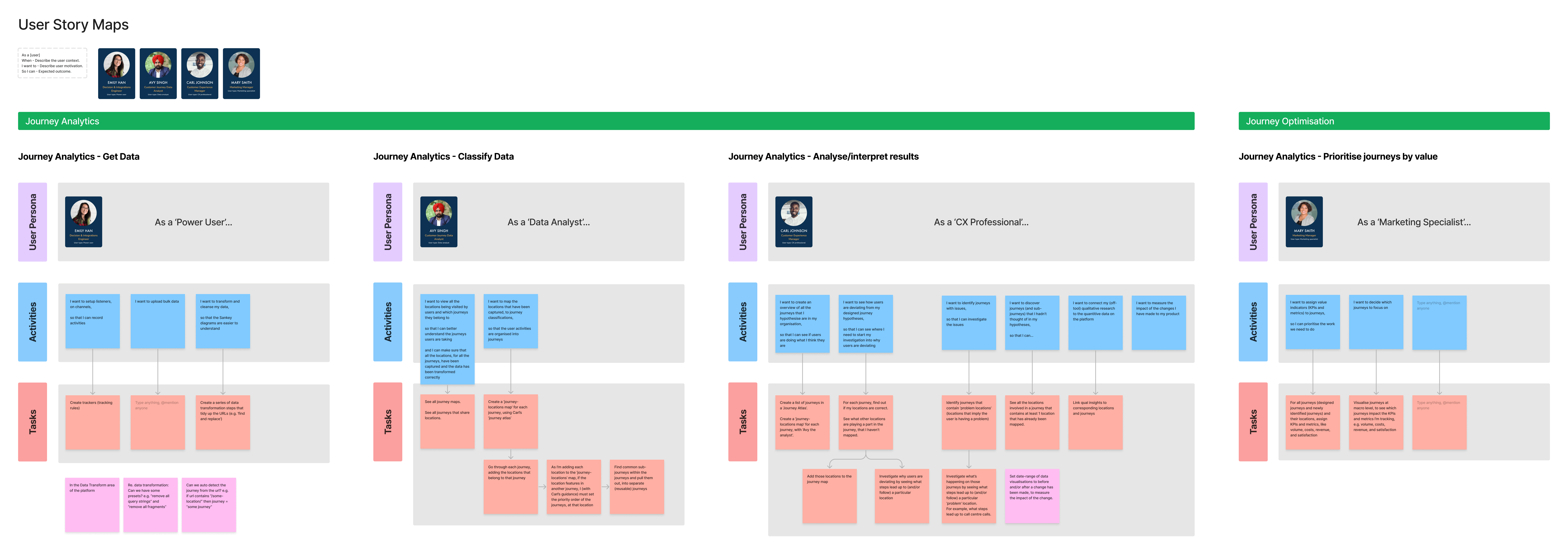
The user flow diagram feeds into the user story maps. Once we know the tasks users perform, at a high-level, we can create the 'stories' for those steps. A user story is written in the format:
- As a [user]
- When - Describe the user context.
- I want to - Describe user motivation.
- So I can - Expected outcome.
Simply put, 'As a user, I want to do something, so that I can get some benefit.' I then created a user story map for each persona. This is where I defined the user stories needed to complete the tasks captured in the user flow diagram.
Information Architecture
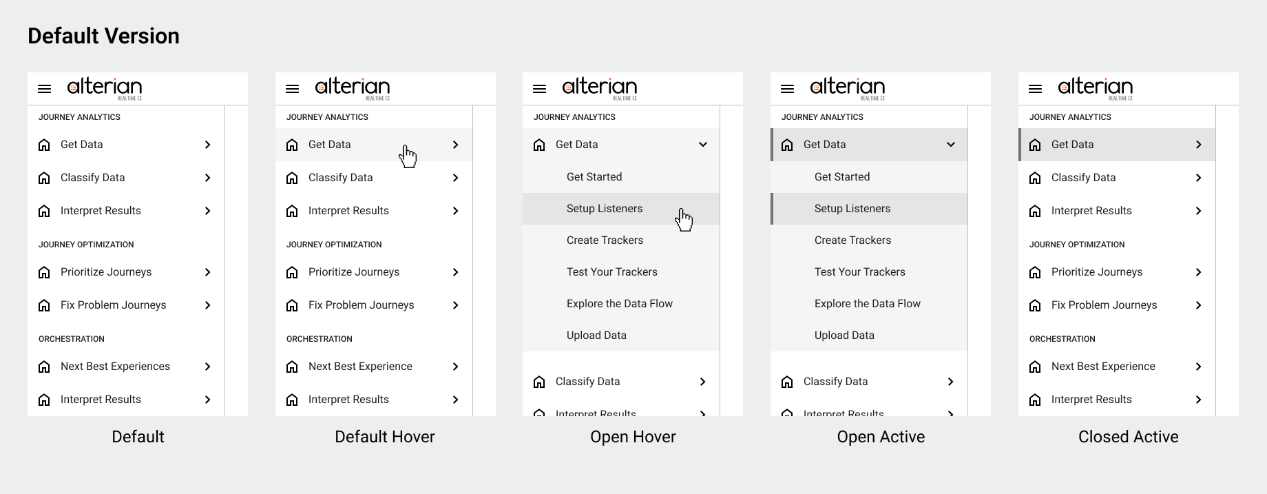
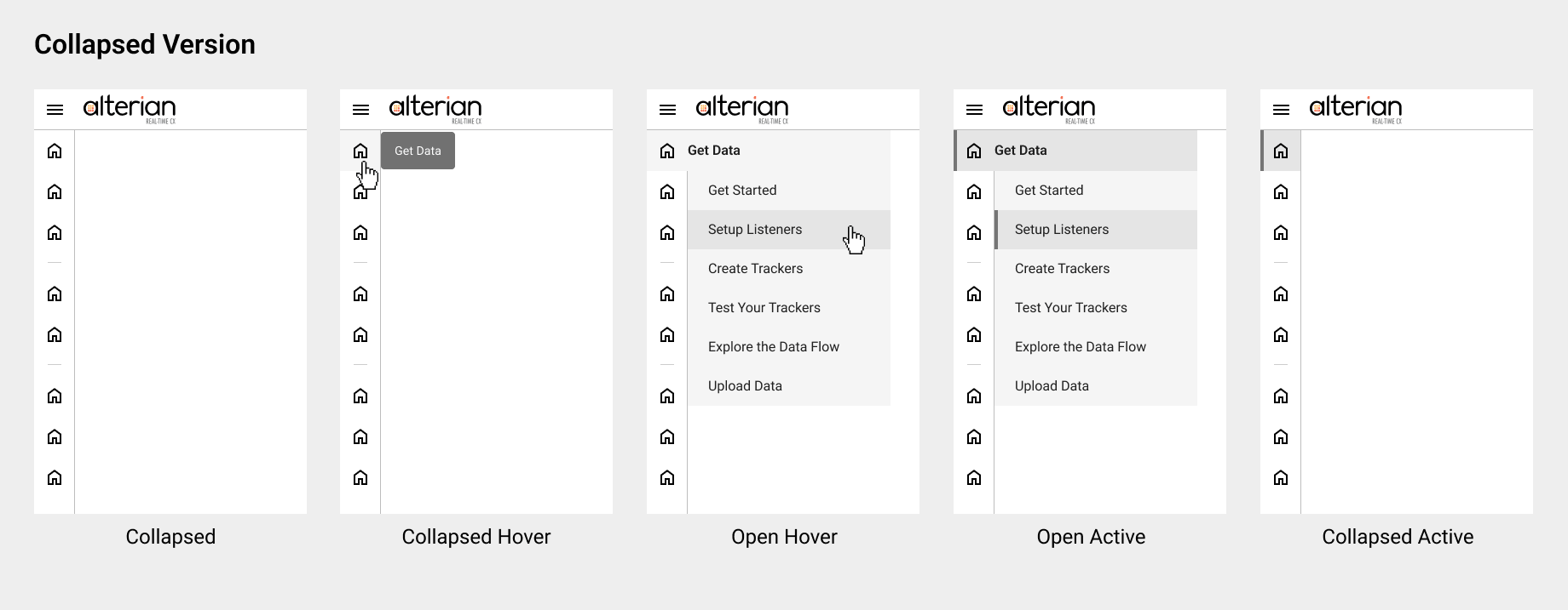
Once we'd mapped the journeys, conceptually, we needed to structure the platform in a way that is intuitive, in terms of accomplishing their goals, by organising the content and features into a logical structure and by designing clear and intuitive navigation. To do this I organised the functionality in an activity-oriented way, mirroring the user flows of the personas.
The user story maps were used to create the activity-based information architecture diagram, which groups the tasks and stories into the different areas of functionality and shows how these different areas are related to each other, creating the site hierarchy.
The IA also needs to accommodate the current features as they currently exist. The current functionality isn't organised in this activity-oriented way. It's framed more in terms of 'what' the user is doing rather than 'why' they're doing it. But as we redesign each feature, we'll transition it to the new activity-oriented way of organising the functionality.
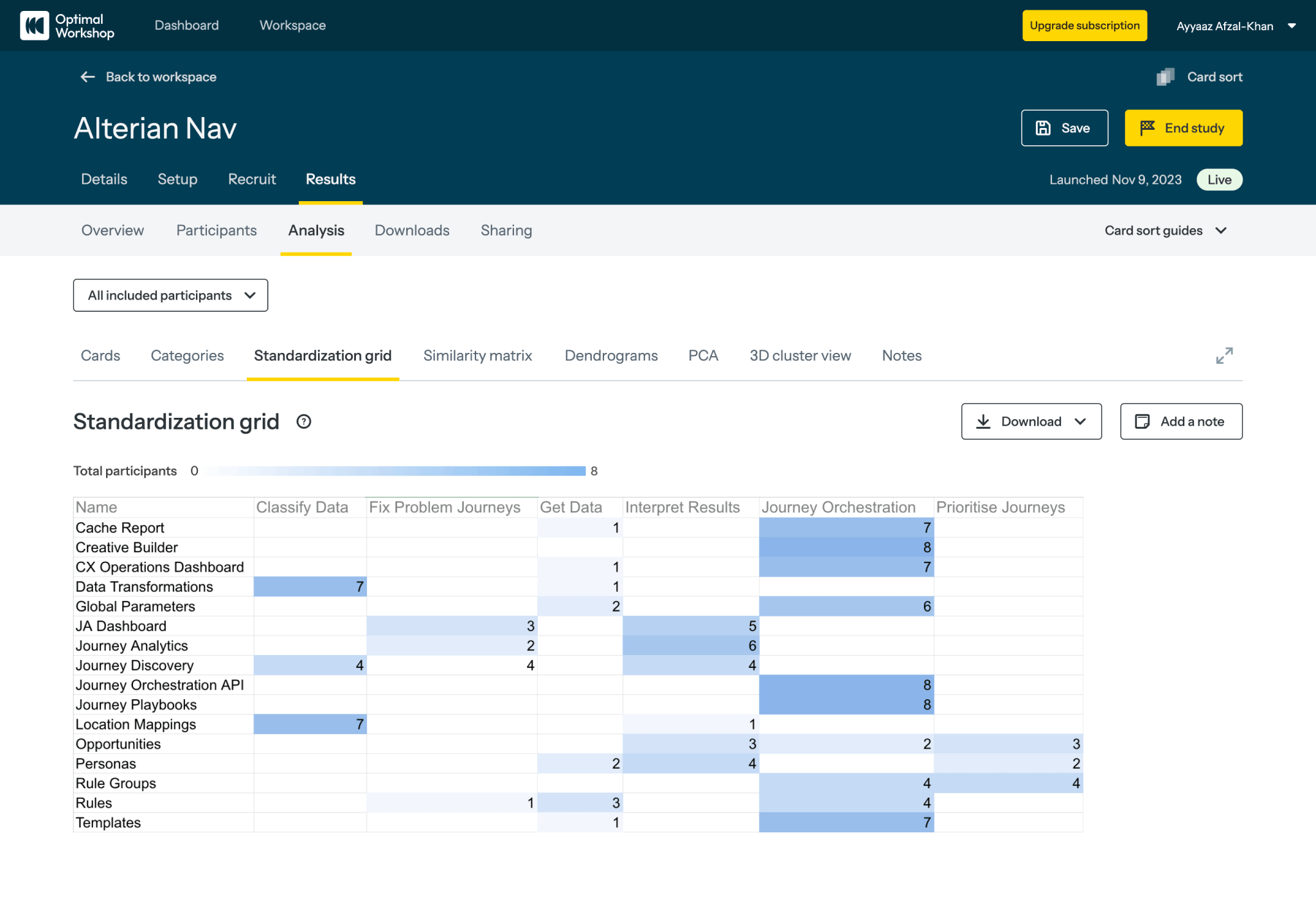
To help decide where the existing pages should live in this new layout, the navigation went through a card sorting activity (conducted with 8 participants), which is done to try figure out where things should live, and tree testing, which is about testing the 'findability' of features.
Card Sorting Activity Results
Tree Testing Tasks
-
You want to connect your channels to the platform,
so that you can record the activities of your users. You want to learn how to do this.
Answer: JA > Get Data > Connect Your Channels -
You want to record the activities of your users by creating tracking rules.
Answer: JA > Get Data > Tracking Rules -
You want to create a series of data transformations to cleanse your data, so that it is easier to work with.
Answer: JA > Prepare Data > Data Transformation -
You want to view all the journeys users are taking.
Answer: JA > Analytics > Journey Analytics -
You want to look at journeys (and sub-journeys) that you hadn't thought of.
Answer: JA > Analytics > Journey Discovery -
You want to map the locations/touchpoints/events to journeys.
Answer: JA > Prepare Data > Journey Location Mapping -
You want to see what journeys are running and create a reusable journey template.
Answer: JO > Planning > Journey Playbooks -
You want to see how users are deviating from your designed journey hypotheses.
Answer: JA > Analytics > Journey Analytics -
You want to identify journeys with issues,
so that you can investigate the causes of the issues.
Answer: JA > Analytics > Journey Analytics -
You've made some changes to your product and you want to measure the impact of those changes
Answer: JA > Analytics > Journey Analytics -
You want to fine tune my setup so that journeys affecting costs are prioritised over journeys that impact other KPIs. You want to decide which KPIs and metrics to prioritise and focus on by assigning value indicators (KPIs and metrics) to the journeys
Answer: JO > Optimisation > Opportunities
By taking an activity-based approach, it forces us as a business to frame the product, not just in terms of 'what' the user is trying to achieve, but 'why' they're trying to do it. This layout was tested with users, through user interviews, and validated by experts within the business.
Design System, Component Library and Accessibility
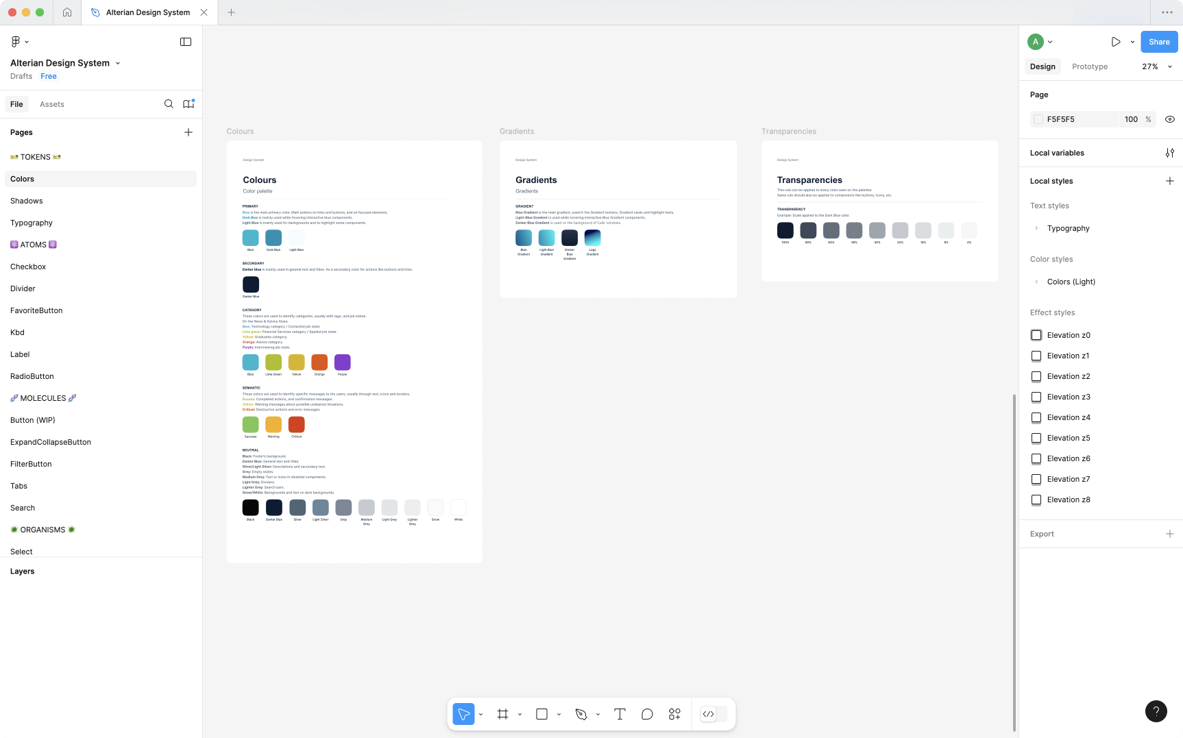
Figma Design System
I created a Design System in Figma, ensuring a consistent design-language throughout the platform. I used the atomic design structure (i.e. design tokens, atoms, molecules, organisms, templates). The components were built with reusability, scalability and maintainability in mind.
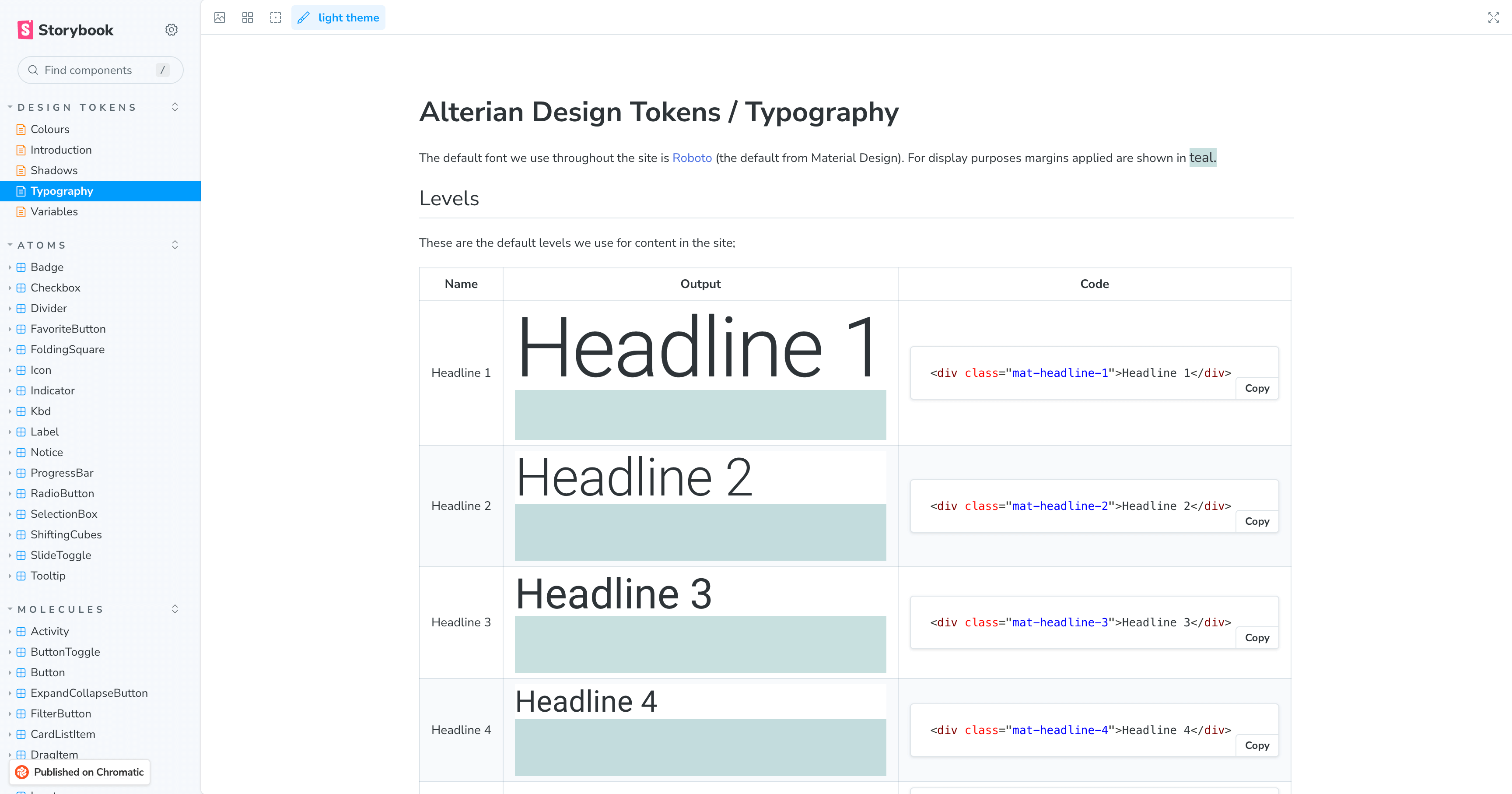
Storybook Component Library
I then worked with the UI team to create a component library in Storybook, as a single-source-of-truth for them. It followed the atomic design structure, mirroring the Design System.
Accessibility Tests
One way I ensured accessibility compliance of the components (with WCAG guidelines) is by using an accessibility checker plugin for Storybook. In the image below, the accessibility tab is selected and you can see that a number of tests have passed in this example.
