UX Warehouse Management Tool
Stages in the 'Design Thinking' process
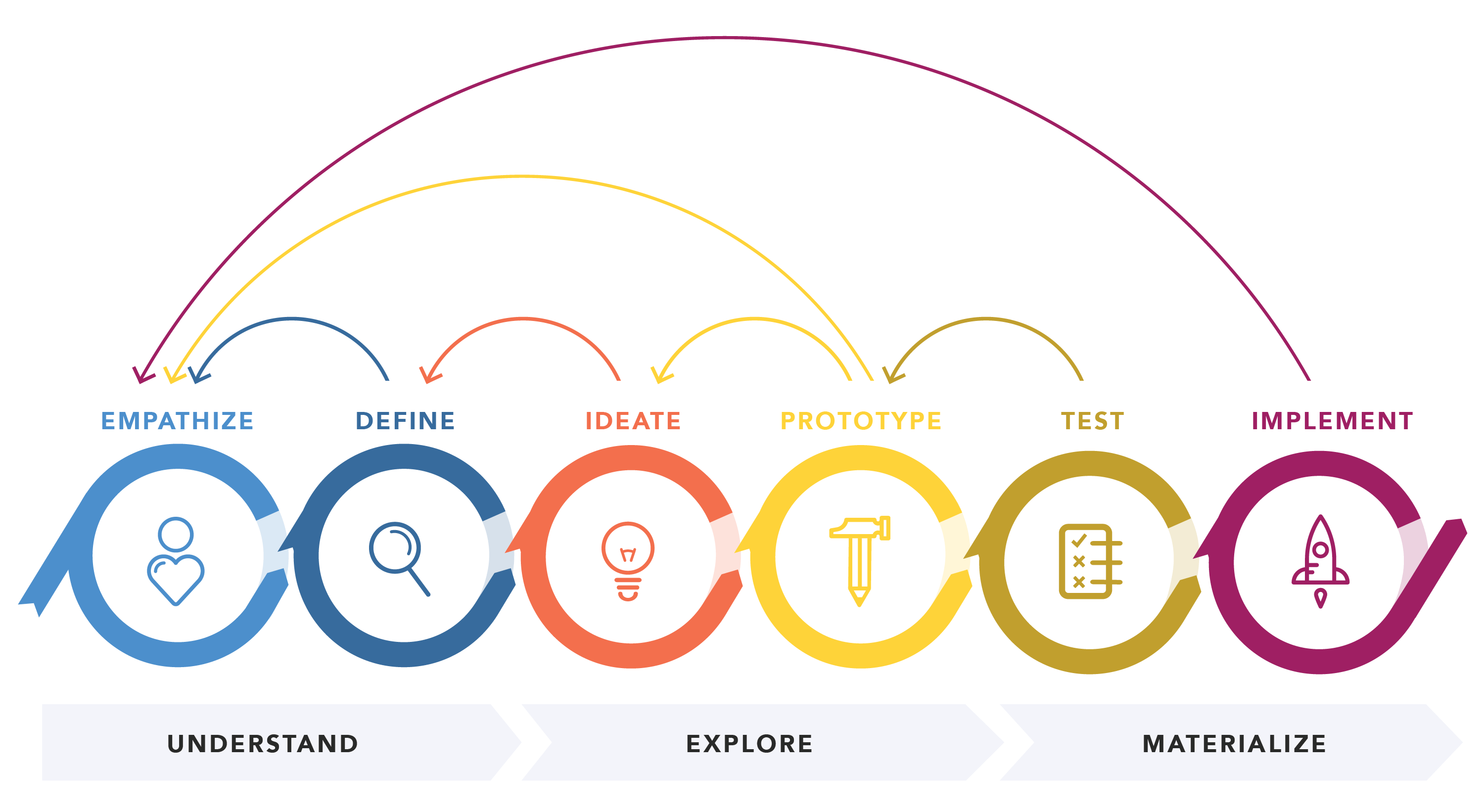
Source: Nielsen Norman Group
Background
James and James Fulfilment provide warehousing and eCommerce order fulfilment services that integrate with the online webshops of their clients. They have a client facing web app and an internal web app for managing their warehouses.

Empathise - The discovery phase
The team leads need a place they can manage pickers and packers from, dynamically, in real time.
We need to understand and discover what content and information to serve, and what functionality to make available to the team leads.
The following activities were performed:
- User research interviews: not only identifying the pain points that initiated this research, but also talking about other dashboards and areas of the app they use, asking what they like and don't like about them. This is to try and not make the same mistakes, but to also learn from what's being done right.
- Ethnographic user research: observing team leads in the field, empathising with them.
- Research dashboard related UX articles (e.g. Nielson Norman, Baymard Institute, Smashing).
Define - The problem description
In the warehouses, the pickers and packers are assigned orders automatically by the system, which calculates the most effecient distribution of staff. However, sometimes team leaders need to make adjustments.
The aim of this project was to create an area from which team leaders can adjust the distribution of staff (pickers and packers) to ensure that all orders are ready for collection before the pick-up deadlines. Currently, this journey is convoluted and involves a series of steps.
Additionally, the following issues were also identified through interviews and workshops:
- Unallocating orders from operators should be made easier. Currently, the team leads temporarily give the operator permission to bulk unallocate themselves, and then revoke the permission.
- Allow campaign orders to be split by client (to assign to operators).
- Oldest orders need to be assigned first (First In, First Out).
- Kill 'find_fingerprint' hack URLs, but scratch that itch. Give the leads a way of allocating orders that are the same.
- 'Campaign orders' link goes to table. Add filters (in 'selection' section) for Client, Priority, and sort by Date (oldest).
Ideate - Evolution of the wireframe
The wireframe is a blueprint of where and how content and components should be layed out. At this stage I'm only interested in the information hierarchy and content strategy (i.e. having the right content in the right place at the right time). No design considerations are made, yet.
Using the findings from research and discovery previous phase, an initial wireframe was created. This wireframe was then tested by users and refined.
The advantage of testing wireframes is that they are easily adjusted. If something doesn't work, it's much easier to scrap it and try something different. Mistakes are caught sooner and their impact is less significant as the time investment is much lower than going straight to prototyping.
Below is the final iteration of the wireframe, before moving to a coded prototype.

Design - The UI component library
An initial library of UI components was created quickly so we could start protyping and testing the designs.


Prototype - 1st iteration
At this point I decided to split the functionality into 2 separate screens. One screen for managing the warehouse staff, in real-time, and a separate dashboard for performing the other tasks.
This prototype is for distributing the pickers & packers and will be displayed on large screens in the warehouse. The time and other data will change and update, live. However, this prototype is not connected to a back-end.
Add pickers and packers, using the input fields, to reduce the time taken for each process path, so you can meet the pick-up deadlines.
1st iteration:

Validate - User testing sessions
The purpose of each round of testing is to improve and refine the design.
The feedback we got was that although all the information required to make decisions was present, it felt too abstract.
Users found that processing the information took them a few seconds; so, I decided to try to make it more visual in an attempt to reduce the cognitive load.


Implement - The launch
This will be displayed on large screens in the warehouse.
